Booking.com
Peace of Mind
Providing customers and partners with clear and simple insurance.
Overview
Insurance can be a source of friction, especially for customers unfamiliar with car rental. A range of products are available, each with its own benefits and terms depending on circumstances. Business reporting highlighted differences in the attach rate of cover products and customer satisfaction across country markets, indicating this was an issue worth investigating further.
Aims
Years of incremental changes had resulted in a fragmented customer experience which was difficult to manage at scale. Re-platforming efforts taking place across the business offered an opportunity to reconsider the insurance product offering and experience with the following anticipated benefits:
- Options to suit a wider range of needs
- Greater clarity and transparency of information
- Improved experience on mobile and desktop
- Increased customer satisfaction and loyalty
- Lower contact and cancellation rate
- Component-driven model reduces time to market
Users and audience
Rental cars almost always come with basic insurance included but this is subject to an excess charge, which means customers pay a contribution towards any repair or theft costs. Booking.com customers are offered the option of adding excess cover when booking a rental car through group and partner websites and apps in 160 countries and 40 languages.
Roles and responsibilities
At Booking.com the product organisation is divided into groups of cross-functional teams. As a Lead Designer, I was responsible for design across the Peace of Mind product group between 2018 - 2020. My role involved influencing, communicating and delivering design efforts aligned with the group's mission.
Scope and constraints
For the initial release, our team was committed to delivering a re-platformed product detail page for mobile and desktop across European and North American markets, including all associated functionality, which could be configured for group and partner brands.
Process
When I joined the team there was an emphasis on design building a backlog of experiments targeted at increasing booking conversion and attach rate of cover products. The team had learned from experience that it was more likely to hit quarterly commercial targets by placing small bets. Conversely, spending time developing large bets involved more risk of failing to meet targets. The first challenge was building a better understanding of the reasons why cover products were performing differently across country markets while maintaining experiment velocity.
Understanding customer sentiment and behaviour
My first move was to conduct an audit of available research tools. This helped steer conversation around methods and a mix of approaches was agreed upon to develop knowledge of differences in the market landscape and customer attitudes towards cover products. I later revisited the audit findings and developed a selection tool to help other teams more easily identify ways and means of conducting their own user research.
Intercept surveys
We then began a series of surveys to gather 'in the moment' feedback from customers. To identify potential opportunities and barriers for the current product we asked customers who made bookings without additional cover: why they didn't choose our product, what type of policy (if any) they chose instead, why they selected alternative cover and where they purchased it from. To understand the scale of opportunity for providing other types of insurance we also ran a separate survey asking customers if they would consider buying various types of additional cover from us and, if yes, how much they would be willing to pay.
I designed and published the surveys with Usabilla (now part of the GetFeedback platform), which was integrated as a trial on the website. Following A/B experiment convention surveys ran for a minimum of two weeks to rule out seasonality effects and until the completion rate exceeded the target sample size. Analysing the data using Google Sheets enabled me to easily spot points of interest in the quantitative data and drill down to customers comments for context. The translate formula is particularly helpful for analysing free text responses across languages. Findings were presented/discussed with stakeholders in a variety of forums, prompting further research and design activities and helping to establish links between business objectives and validated user needs.


Gathering website feedback proved to be a cost and time-efficient way for the team to engage directly with customers at scale, enabling us to identify opportunities for design exploration across the spectrum from tactical quick wins through to influencing product strategy. Conducting this series of surveys, the largest of its type conducted by the business to date, also triggered increased engagement with Usabilla across the organisation enabling me to successfully make a case for extending the software license.
Journey analytics
It can be tempting for teams focused on conversion to move on to new ideas without evaluating unsuccessful experiments. Alongside gathering customer feedback, we wanted to learn how previous experiments affected user behaviour through the booking funnel. Our belief was that this would help us make better, more informed decisions going forward. Performing the research tooling audit enabled me to identify the opportunity to engage Clicktale (now part of the ContentSquare platform) to analyse a selection of previous experiments using consulting time built into our contract. I created a brief and liaised between our analysts and Clicktale to ensure they had the information required to conduct their analysis. Findings highlighted several potential quick win user experience improvements which were taken forward as part of efforts to optimise the mobile experience.
Co-designing solutions
Cover products are just one part of customers end-to-end experience, therefore, it was important to seek involvement and feedback from other designers, product teams and wider organisational departments (e.g. Compliance) through the design process. Widening participation enabled us to share our knowledge and benefit from a broad range of perspectives on how we might help customers find their best choice.
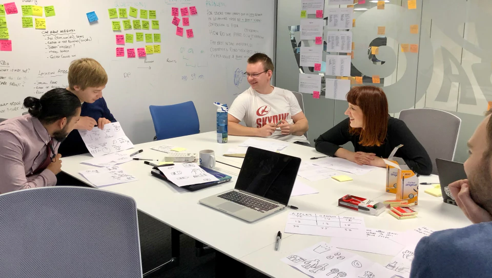
Design sprints
Sprint-type workshops were already established across the business. I organised a number of one-day mini design sprints and shared knowledge of business objectives and observations gained from research. The assembled groups then worked through typical co-design activities to frame problems and explore solutions to identified needs.
Design critiques
Critiques were less familiar outside the design team but had begun to gain popularity as a way of gathering input from stakeholders who would not usually participate in workshops. I established regular check-ins with stakeholders as we began to refine ideas generated in the design sprints and introduced the Rose, Bud, Thorn technique to encourage balanced constructive feedback.
Developing hypotheses
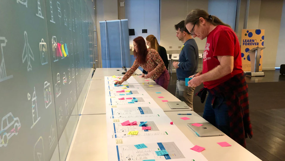
The next step involved taking the themes developed from research and co-design activities and distilling them into testable hypotheses. Booking.com are well known for A/B testing proposed changes to the customer experience. Prior to this, we wanted to de-risk our proposals as far as possible to ensure the best chance of success. The challenge was crafting solutions which balanced team objectives alongside compliance requirements.
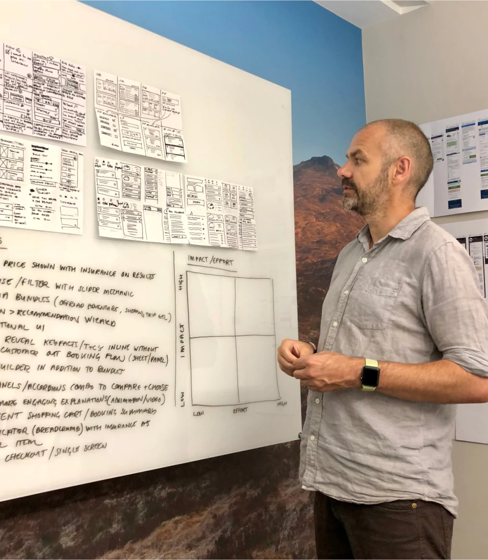
By this point, a researcher had joined the team and we worked together with a writer to iteratively improve ideas. I focused on producing prototypes and the researcher conducted remote user testing to evaluate comprehension and usability, identifying issues addressed prior to A/B testing. Alongside general improvements to user experience, we developed three distinct options addressing our aims of providing options to suit a wider range of needs and greater clarity and transparency of information.
Featuring a cover product value ladder, the copy-driven approach performed well in usability and comprehension testing with customers able to articulate the benefits and differences between existing and new products. However, increasing the cognitive load on users by offering more information upfront and options to choose from was acknowledged as a risk.
A feature comparison table design was lobbied for by some key stakeholders. The team were less keen on this approach due to it being impractical when products did not lend themselves to cross-comparison and awkward presentation on mobile devices.
Offering an unambiguous yes or no choice addressed concerns around a contentious pattern in the existing website user interface and countered the potential paradox of choice issues presented by multiple-choice options.
Design handover
We now had a raft of options which could be developed and tested with real customers at scale in production. To meet milestones for re-platforming efforts the team agreed on a selection of changes it felt would deliver the most impact and could be delivered in the time available.
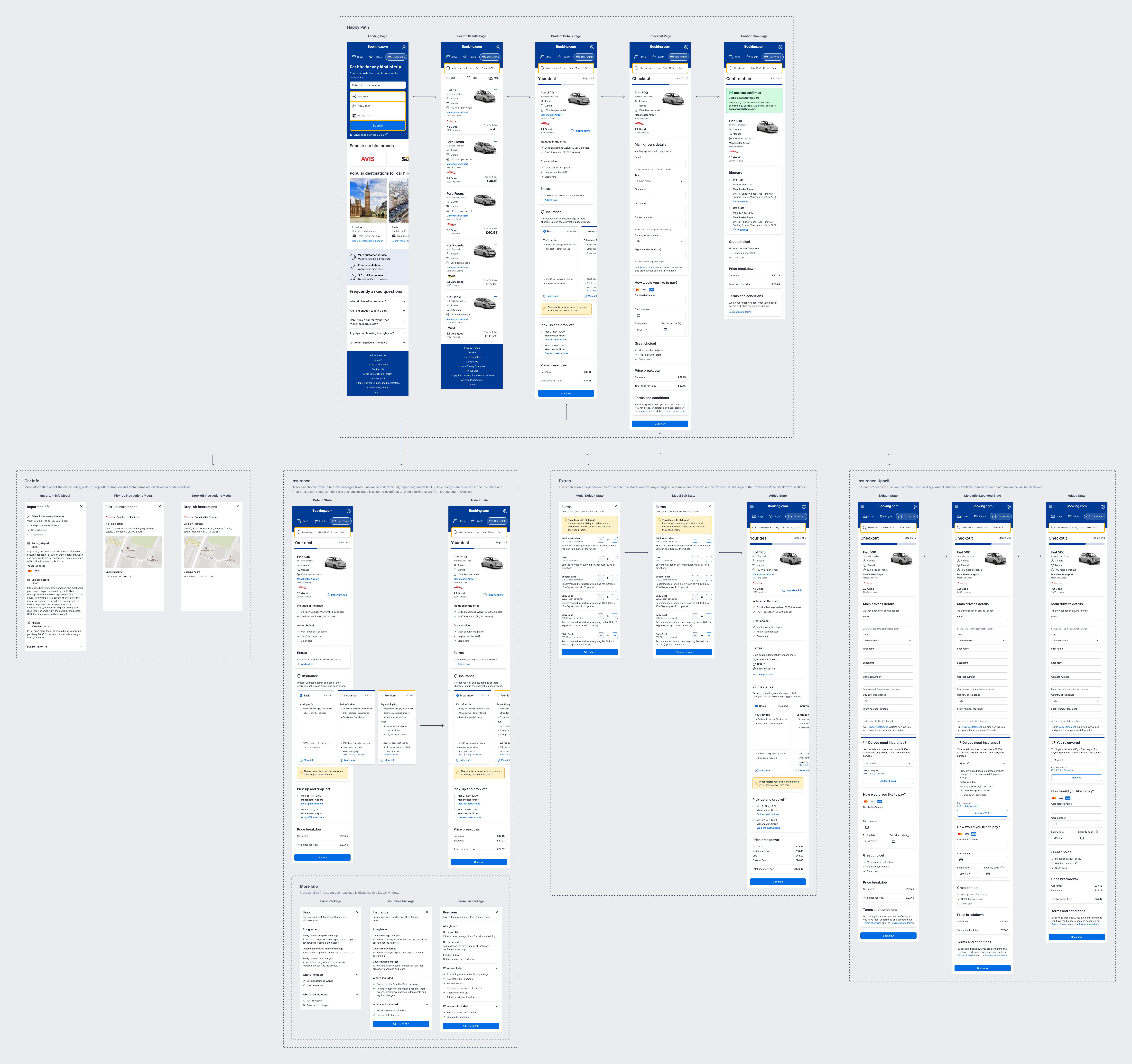
As components for the re-platformed experience were built using the new technology my focus shifted to supporting development by creating design specs and collaborating with engineering colleagues to bridge gaps between the design system and code documentation. I also developed a team website using Google Sites creating a centralised 'single source of truth' reference for research, copy and design documentation to effectively share knowledge across the wide group of stakeholders involved.
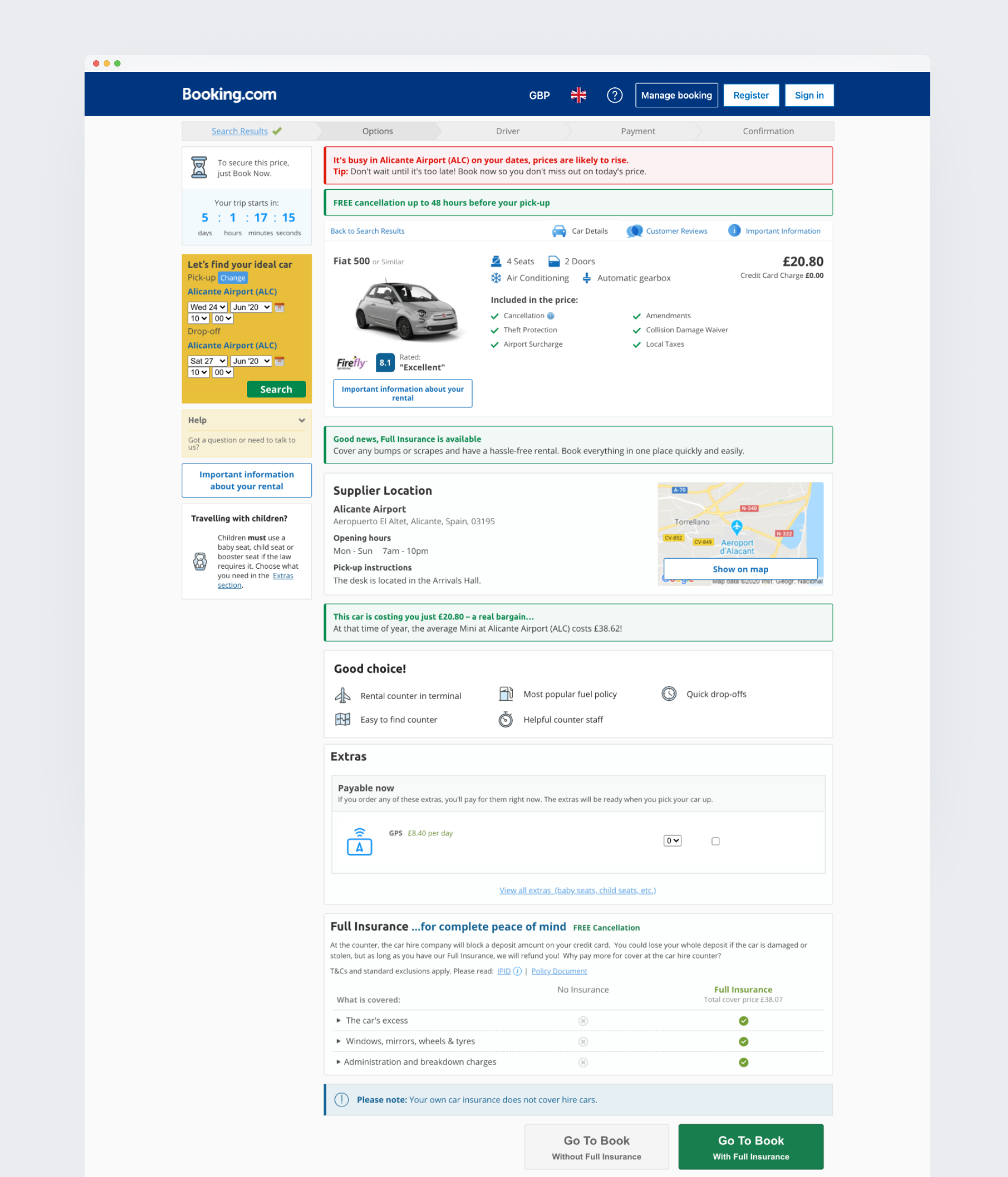
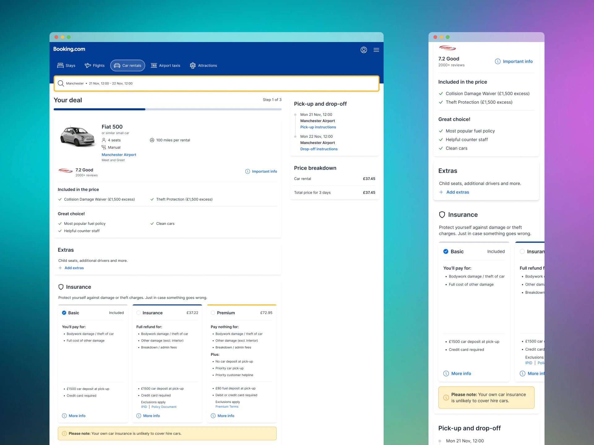
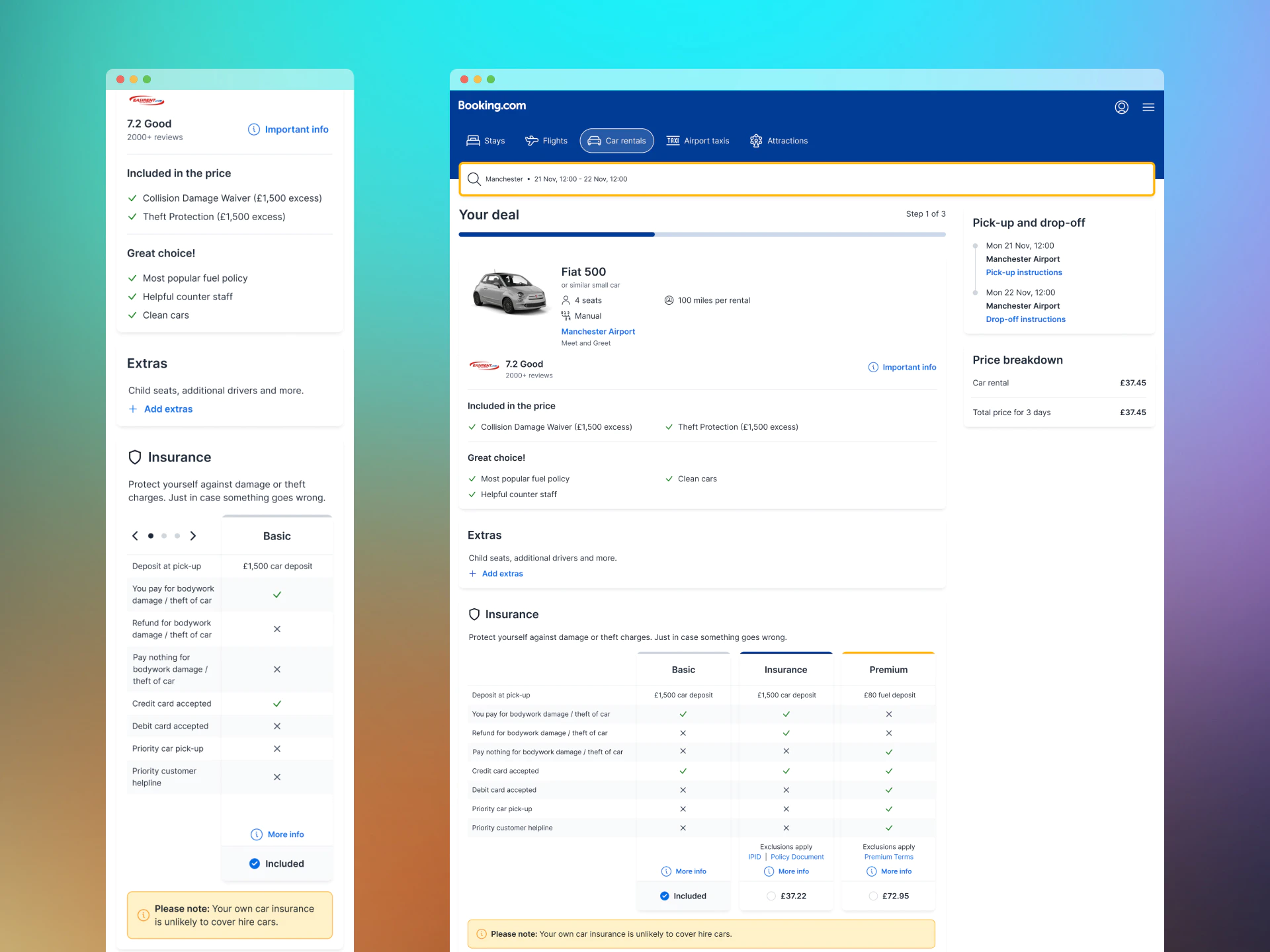
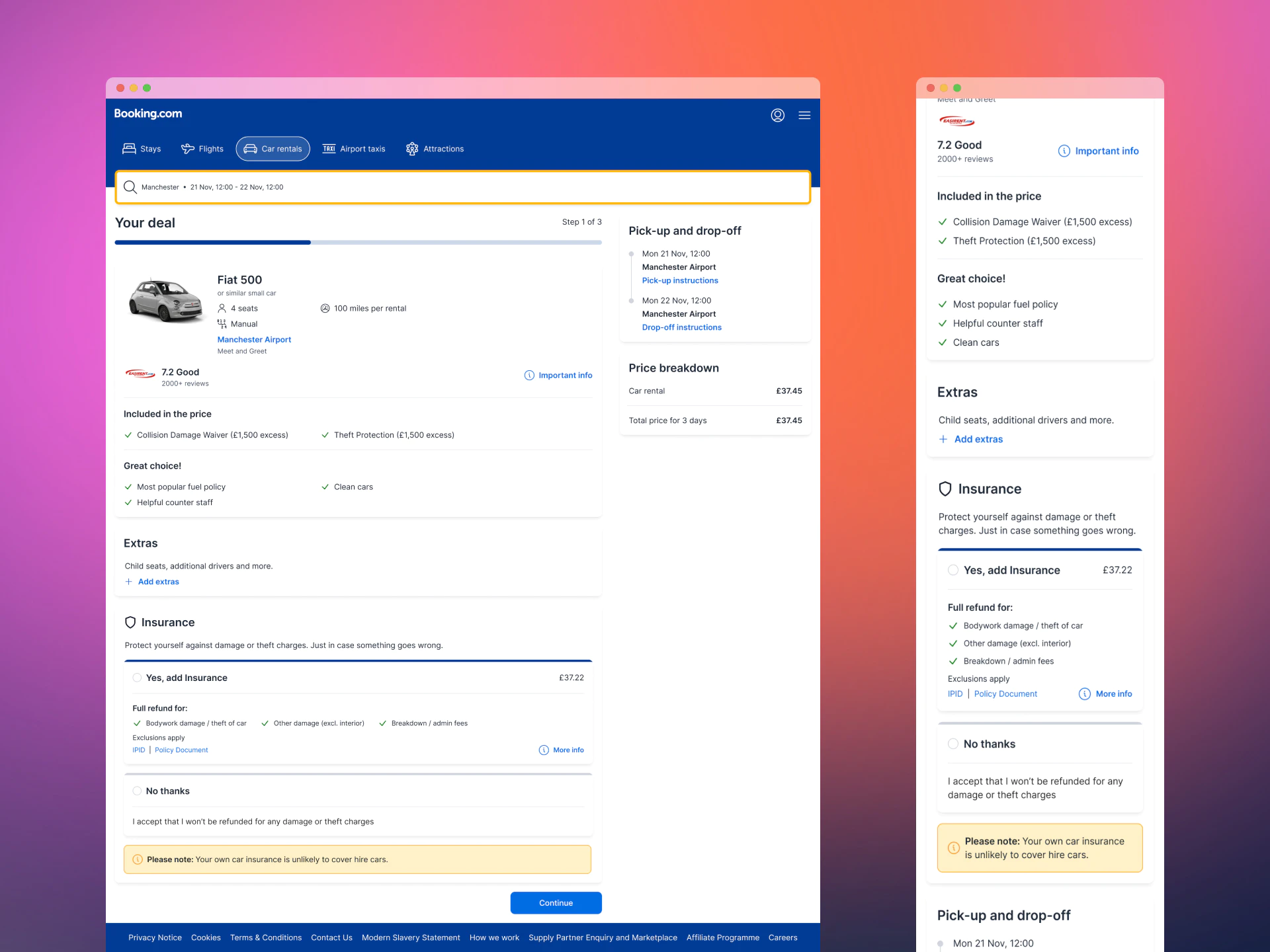
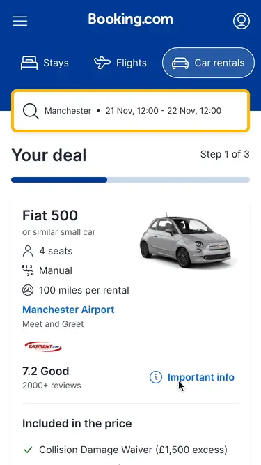 Car information
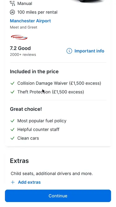 Adding extras
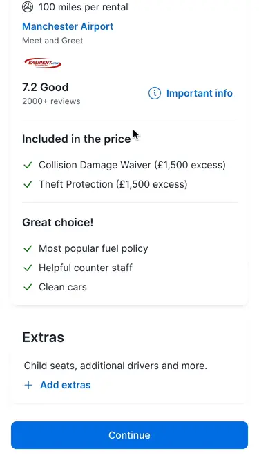 Choosing a package
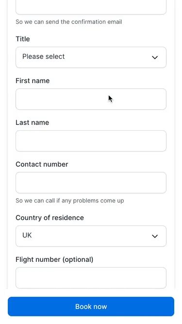 Insurance reminder
Outcome
The updated product detail page was released on schedule, enabling the business to launch an improved end-to-end experience built on new technology, and the Peace of Mind group to test a new presentation offering customers more choices and clearer information. Additionally, design input resulted in the following positive outcomes:
- Customer insights captured and translated into user needs aligning with business goals.
- Successfully made a case to extend licensing agreement of research tooling.
- Documentation was created reducing compliance risk and time to onboard contributors.
- Increased consistency and reuse of components across the customer journey.
In terms of personal lessons, this project stretched me outside my comfort zone, highlighting some areas for development. With many interested parties involved my natural preference to create space to work through all the angles before making recommendations didn't meet some stakeholders expectations. It was uncomfortable at times, but I'm glad for the opportunity this engagement offered to reflect on my approach and adapt ways of working to suit the needs of different audiences.